Designing Color Guard Flags
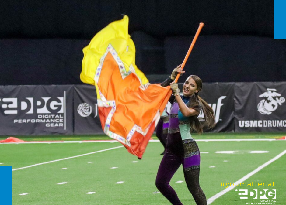
So, what is going on your flag? While an idea may seem beautiful on the screen, it’s important to consider what it will look like on the flag as it spins from a distance. Some crucial points to consider are the image itself, as well as the scale, contrast, and colors you use as you manipulate the image.
Using Images with Flags
Be sure your image is high quality and will print well on a large scale. Shutterstock is an excellent place to look, and if our design team is taking care of your flag design, your Shutterstock image is included in your design fee. You do want to double check that your image is licensed for commercial use. Some original art and other Shutterstock images may not be, so check the fine print on the side of the image. If you are creating your own image, make sure your image is large enough to meet our specifications (see below for more information).
Using Images with Flags
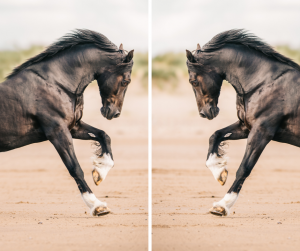
Are you using a circle or other large predominant image on your flag?
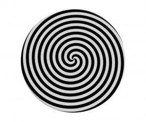
What About Placing Text on a Flag?
- If you want the audience to read your text, think about the dominant spin direction of the flag.
- Is the text is facing out towards the audience or not? This may require you to flip your design to get your desired effect.
- Remember that small text will likely be hard to read from afar
- Choose bold fonts and colors.
- Make sure they contrast well with your background
- Always mock up your image on screen! It may look different on a flag than it did in your head.
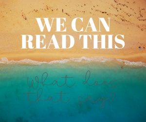
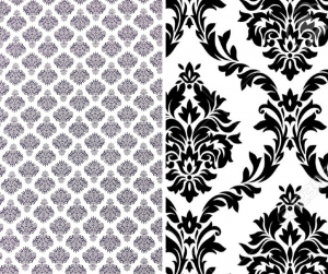
Scale Considerations on Your Color Guard Silks
The scale of the images on your flag is critical to getting the effect you want in your flag. Remember that just like text, if the details are too small, they probably won’t read from far away and will turn into a whir of color as you spin.
For example, if you want a damask pattern, consider zooming in on the pattern instead of trying to use the entire image. You’ll get the same feel, but the audience will be able to see it from the top of the stands.
Contrast Considerations in Your Flag Designs
If you really want something to stand out on your flag, be sure to choose tones with high contrast so that your colors don’t blend when you want them to stand out. For example, black and white together will be more impactful than light gray and dark gray together.
There are lots of resources on the internet to help you understand which colors complement and contrast better. One of our favorites is a Color Wheel Calculator that will help you to choose matching and contrasting colors after selecting a primary color palette.

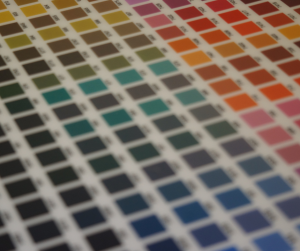
Color and Color Matching Your Winter Guard Flags
Matching colors is difficult in a digital world. Every monitor will have a slight variation from the printed product, and from every other monitor you view. Think about when you go to Target or Best Buy. There is a wall of TVs there that all are broadcasting the same image, yet they all have slightly different colors. They may not be significantly different, but no two are exactly identical. That is why it is best to use a color matching system that enables you and your color guard flag printer to be on the same page. The best way to match a specific color is with a physical Pantone color chart, but online ones will give you a good approximation.
If you are designing your own flags, be sure your color profile is set to CMYK, not RGB. While your phone screen is in RGB, making colors look vibrant and bright, all printers produce products in CMYK, so designing in that mode will give you a more accurate representation of your finished product.
Also, consider the fact that your screen is backlit. This produces colors that are much more vibrant than a printed image. Very subtle color shifts that are evident on a screen may not translate perfectly to a printed product. If you are in doubt it is always best to get a printed proof of your winter guard silks to ensure they look as good as you are imagining them.
Specifications for Designing Your Own Flags
General Information:
- 300dpi- make sure your resolution is set to 300 dots per inch to avoid blurry images
- CMYK color profile- we print in CMYK, so designing in it (as opposed to RGB) give you a better idea of your printed product
- Contact your Account Executive for more information! www.dpgperforms.com/contact
Want to try out your ideas?
Check out our Custom Flags Online Design Tool
Want a custom flag fast?
Try out our pre-designed customizable flags.


